By Irina Linnik on September 09, 2019 in eCommerce Design

Shoppers expect their online experience to be smooth, lightning-fast, and highly personalized – not less than that. So how do e-commerce stores keep up with that?
Design is one of the factors that form the user experience. Even though every store is unique, there are a few best practices that every entrepreneur should follow.
1. Suitable theme
The e-commerce theme serves two important goals: it forms the right perception of the brand and helps speed up the site performance.
First, you should look for a theme that would correspond to your brand in terms of color and visual elements. Second, your theme must be light-weight and easily navigated.
When choosing a theme for your store, there are two options: a readymade and custom theme.
Readymade theme
A ready theme is the one that you can find in the Marketplace. Such themes have standard e-commerce functionality and are usually well-optimized for SEO.
However, some ready themes have poor code quality which may lead to slow performance and inability of a theme to handle the real traffic load. As well, there is no guarantee that a ready theme will correspond to your brand as you wish.
However, this is not a common issue. As for the other advantages, readymade themes have an affordable price and can be installed immediately after the purchase.
Custom theme
A custom theme is the one you develop from scratch. While it demands more time and money, it has a few unbeatable advantages:
100% relevant to your brand
Full control over the quality
All needed functionality available
Since you will be the one controlling the theme development, you are free to add any elements and keep an eye on the theme’s quality and performance. A custom-made theme is a good option for well-established brands that need a reliable and personalized solution.
Smooth navigation
Navigation plays a big role in the user experience. If the user cannot find the desired product easily or has any other troubles with navigation, you will immediately see it in the bounce rate and page view metrics.
It is therefore important to think of the possible user journeys and adjust the navigation correspondingly. Here are a few things to pay attention to:
Internal linking: do you have enough number of internal links in the right places? Do they lead to the right pages?
CTA buttons: can the user see them? Do they lead to the needed pages?
Are your categories simple or too confusing to navigate?
Is your search working well or lacks certain features like auto-suggestions?
Is your checkout complex or easy and intuitive?
Outline the user journey before launching the store and perform A/B testing to see whether the navigation is clear and the users can easily find the desired product.
User-friendly checkout
Checkout is the most critical area of your store. It’s where the customers decide to pay their money for your products so a good checkout design is an absolute must.
The biggest complaints that users leave about the checkout are:
Too many fields
Confusing navigation
Obligatory registration
In order to optimize your checkout and make it more user-friendly, follow the simple rules.
Minimize the number of fields
Have a look at your checkout: do you really need all the fields present or did you just copycat them from a competitor?
The fewer fields a checkout has, the faster a customer can complete the purchase. For example, place the name and the family name in one field instead of breaking them into two.
Add a guest checkout option
Lengthy and obligatory registrations are incredibly annoying and users hate losing time on them. To fix the problem, offer an option of a guest checkout.
With guest checkout, the user only needs to enter the email and proceed to the payment with no need to create a user account. As well, many stores offer checkout via social media or PayPal, which is also quite time-saving.
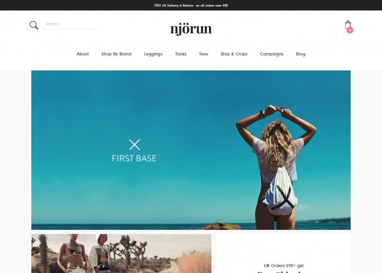
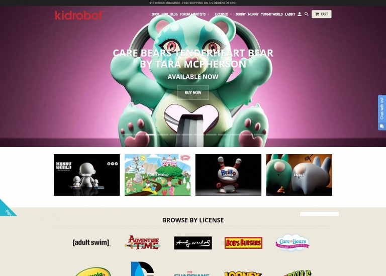
Good product display
Product images play a big role in the users’ buying decision so you want to make product images as attractive as possible.
There are a few main rules to follow when making product images for an e-commerce store:
Retain the high quality of the images (but you can sacrifice it in case of thumbnails)
Choose the right image format (JPEG, PNG) to find the best match of quality and size
Resize the images to make them less heavy and thus speed up the store performance
Add zoomed-in photos that show certain details of a product
One of the main things to remember about product images for an e-commerce store is to watch their size. Heavy images are one of the primary reasons of slow performance. This, in turn, causes negative user experience and reduces the conversions. This is why it is critical to choose the right image format and size – in this way, you can retain the high quality and suitable size.
Interactive CTA buttons
Call-to-action buttons are the primary source of interaction between the shoppers and the store. They promote and encourage all sorts of action, from adding a product to a cart to signing up to become a member of a VIP club.
CTA buttons are essential as they navigate the users, give advice on the next action and promote needed actions. However, their design has certain rules that need to be followed if you want to ensure the users see the buttons and click them.
Placement
Higher placement of CTA buttons tends to cause better response from the user as it ensures the button can be easily spotted.
As well, place the button near important page elements: price, product photo, etc. In this way, you will also increase the button’s visibility.
Color and size
You want your CTA buttons to be seen so make them big and bright. Do not hesitate to use bold colors and make the font larger than the rest of the copy on the page.
Some sites use ghost buttons as their CTAs. While it may decrease the chances for the button to be seen, it can actually work for your specific store. Perform A/B testing to see which button format works the best.
Message
How many times have you seen a “Shop now!” button?
This is a perfect example of a cliché and you don’t want to use that. Instead, tailor your CTA to your products and store: write “Explore the jeans” or “Find your perfect fit” instead of “See more”. Such customized CTAs tend to perform much better than standard ones.
Summary
The design of an e-commerce store should be focused on usability and customer experience. If there are any problem areas with your store or it does not look appealing, it will hurt your conversions really bad.
To avoid such situations and ensure that your store both looks and performs in a seamless manner, hire Magento developer to help you tweak the store and don’t forget to perform market research to ensure that the design corresponds to the expectations and needs of your desired target audience.